OCC Summer Camp 2: Happy Birthday Polaroid Card

I can’t believe the Online Card Class Summer Camp 2 is almost over. It’s been a full three weeks with lots of wonderful assignments and inspiration. Unfortunately, I have been traveling and not able to devote as much time to participating as I would like. I will catch up eventually!

This assignment is from Week 3, Day 1. We had to choose at least four colors from a palette of tan, brown, light purple, a brighter purple and a turquoise. Per the instructor’s example, I created a background layer using two sheets cut at an angle. To create a honeycomb design, I stamped a sheet of light blue card stock with purple ink and a Lawn Fawn Interlocking Backdrops stamp. I attached this to another a light purple sheet of card stock that I had dry embossed with a larger honeycomb pattern. I covered up the seam between the two papers with a narrow strip of brown paper.

Say cheese! A birthday card with a Polaroid focus.

Say cheese! A birthday card with a Polaroid focus.

For the focal point, I used my new Polaroid die from Lawn Fawn. I cut it out of craft paper and stamped the birthday sentiment in Versafine brown ink. Then I die cut three sheets of bright purple card stock, adhered together to make a thick layer, with a Simon Says Stamp die cut, Oh Happy Day. I adhered the Happy portion with Tombow Mono Multi Glue across the midpoint of the frame.

For a bit of sparkle, I punched two flowers with my Martha Stewart punch in a glitter card stock in coordinating shades of purple and blue. In the center I adhered a turquoise rhinestone.

The entire layer was attached with foam squares to a card base from Neenah Desert Storm craft paper.

I don’t think I would have put this color combination together on my own, but I think I like the juxtaposition of the brighter pastel colors with the neutral shades of tan and brown. What do you think? Thank s for looking!

OCC Summer Camp 2: Hello Owl Embossed Card

For another second week assignment in the Online Card Class Summer Camp 2, I decided to try a heat-embossed card from Day 2. I used the same color palette as before: cream, light blue, two shades of green, and brown.

An owl card for my niece at summer camp.

An owl card for my niece at summer camp.

The idea here is to stamp your images with embossing ink on colored card stock and heat emboss it with clear embossing powder. This gives it a clean, two-toned look. I used a new stamp set, Recollections Cling Set, that I got on clearance at Michaels for $.99 (yay, savings!). I don’t see a name for this set, but its main image is a big owl, and it includes a branch and leaves that you can stamp separately.

After I heat-embossed my images with Versamark Ink, I carefully cut around the edges, leaving a small rim. I used a tape runner to adhere the branch, and foam squares to give the other images more dimension. I added two blue rhinestones to make the owl’s eyes.

I was tempted to dry-emboss the blue background, but I decided to leave it simple. The background paper has a subtle texture to it. I stamped the “hello” sentiment in a brown Versafine Ink. After rounding the corners, I adhered it to a top-folding card base from Neenah Desert Storm.

My niece loves owls (as do I), so I will mail this to her while she’s away at summer camp. I think she will like it.

What about you? Please tell me what you like. Thanks for looking!

Fashion Birthday Card

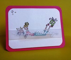
Here’s yet another take on a birthday card. This one is fashion-themed for my friend Tracy’s upcoming birthday. She loves pink so I used a corally pink card base from Bazzill.

A simple and girly birthday card for my friend.

A simple and girly birthday card for my friend.

I love this girly stamp from the Penny Black “A Little Bird” stamp set. I used black onyx ink from Versafine on watercolor paper. I took my Tim Holtz Distress Markers in a variety of colors, along with my waterbrush, to color her in. I find that the Tattered Rose shade makes for a lovely skin color.

To make sure the focus was on the image, I took a cue from a recent Online Card Class, His & Hers, to create the sentiment. I stamped the Happy Birthday sentiment, from Stampendous, with Versamark embossing ink on a narrow strip of vellum. Then I heat embossed it with my heat gun and white embossing powder. The vellum is secured on the back sides with a little adhesive. I’m not sure if the full effect is clear through the photo, but I really like how the image can be seen through the sentiment.

For the finishing touches, I used my Sakura Jelly Roll pen to add a tiny bit of shimmer to the birthday candles and bow on the present. Then I added three rhinestones and rounded all four corners of both the image and the card base with my Corner Chomper.

Now I just need to add a personal note on the inside. I think Tracy will love it!

What do you think? Thanks for looking!


His & Hers: Wow Card

For Day 5 of His and Hers Online Card Classes, one of the instructors showcased a double-embossing technique. This is where you run an embossing folder through an embossing machine (I used my Sizzix Big Shot) to dry-emboss it, and then wet-boss it using embossing powder. Here’s my example:

A double-embossed congratulations card that appeals to both men and women.

A double-embossed congratulations card that appeals to both men and women.

It’s funny, this assignment was supposed to focus on love or anniversary cards for males and females. Unfortunately, right now I do not have a significant other in my life. so I decided to create a general card instead. I went with a “wow” theme that can be used to congratulate someone, which I figured would be appropriate with all the school graduations coming up.  Of course, “wow” turned upside down also turns into “mom,” which can be used for Mother’s Day.

I used a white card base and dry-embossed it with a Spellbinders embossing folder in a harlequin pattern. I think the diamond shapes appeal to both men and women. Then I ran my embossing powder tool thoroughly over the design, especially in the recessed portions. The idea behind this technique is to wet-emboss only the raised images, so the powder that gets in the recessed areas helps to resist the embossing ink. This is an important step! I tried it without it, and the embossing powder stuck everywhere and created a mess.

Then you lightly run a clear, sticky embossing ink like Versamark over the embossed (or raised) images. Just rub the ink pad over it directly. Next you sprinkle an embossing powder over the inked design. I used Stampendous Pirate Gold. You probably will still get stray embossing powder in the recessed edges, so be prepared to take a clean, tiny paint brush to carefully brush away the excess powder before drying it with your heat tool. As you can see, it’s still not perfectly embossed, but I think that adds a homemade touch to the card.

In keeping with the clean and simple design example, I used my Cricut Mini to cut out a simple word, Wow, in white paper. Then I backed the cut-out piece with a scrap of gold paper that matched the gold embossing powder. I adhered it with dimensional foam to add a little depth.

That’s it! Now I have a gender-neutral card just waiting to congratulate a friend or family member on their next accomplishment. Enjoy!

His & Hers: Mother’s Day Card

Our fourth assignment in the Online Card Classes His & Hers focused on Mother’s and Father’s Day cards. Here is my Mother’s Day version:

My Mother's Day card in hot pink and soft apricot.

My Mother’s Day card in hot pink and soft apricot.

I was a little hesitant to pair such bold colors together, but I am really liking it!

This card is a little different in that the recipient untucks the smaller hot pink paper (with the sentiment on it) from under the little white heart. Then the damask card opens up for a personal message. The card itself is attached to the larger piece of hot pink paper.

I am already anticipating having to give my mother instructions on how to open it. LOL! She’s always been a little goofy, and no joke, I had to tell her how to open up her Elvis double-set of CDs the other day. It will be fun to see what she thinks of this card!

The hot pink paper is from a 12 x 12 DCWV “A Type of Art” cardstock pad (that I got on clearance, even better!). The card was made from white cardstock stamped in Hero Arts Shadow Ink Soft Apricot on a Stampabilities Tapestry Pattern wood stamp. I embossed the sentiment (from the Simon Says Stamp “You” set) in white, and then adhered with Tombow Mono Glue the MOM letters. They are from Tim Holtz’ grunge board, and I painted them with a silver Ranger paint dauber. The silver paint matched perfectly with a scrap of silver paper from the same paper pad, which I punched with my EK Success scallop punch.

The heart is actually four pieces of white card stock punched with a mini EK Success heart punch, adhered together with glue, and then covered with white Enamel Accents.

The only thing I’m not happy with is the white edging around the card. My first couple of dashes were okay, and then my white gel pen started drying up. Then I tried another white gel pen. Also dried up. By that point I already had a few lines that couldn’t be erased or covered. Finally, my Tim Holtz Distress Marker in white came to the rescue, but the liners are thicker and fuzzier than I would like. Next time, I will double-check that my pens have enough wet ink to cover my entire project!

Normally for this class I make both a feminine and masculine version of the same card. The class has some beautiful examples of Father’s Day cards. Unfortunately, my dad passed away last year, and I am just not up to making a Father’s Day card, even for practice. He is definitely in my heart.

I hope you enjoy this Mother’s Day card. Please let me know what you think!

Thank You for Your Friendship Embossed Card

Here’s a card inspired by yet another ShopKick graphic. It’s still not exactly what I was hoping to achieve, but I think it works:

I had to experiment with my new Anna Griffin embossing folder.

I had to experiment with my new Anna Griffin embossing folder.

I had just bought this lovely Cuttlebug embossing folder by Anna Griffin, called Foulard. I ran it through my Big Shot twice using two pastel cardstock papers in a muted pink and teal. I cut these embossed images into quarters, making sure to slice exactly through the center lines of the pattern. Then I used my Tim Holtz sanding block to gently scrape away the top layer to better reveal the embossed design in the white core.

Next I took a white card base sized 5″ x 6.5″ and lightly penciled in grid marks against my ruler so I could line everything up evenly. I alternated the pink and teal panels (2″ x 2.75″) to form the same embossed design on the card. I left a small horizontal space between the two rows to stamp my sentiment, which came from the Hero Arts Everyday Sayings stamp set. I adhered the panels using 1/8″ inch foam adhesive squares to give them a little depth (and to account for the unevenness of the embossed design).

I rounded the corners using my Corner Chomper and tied a white hemp cord at the top for the finishing touch.

I will continue working with this concept of using embossed panels pieced together to form different designs. I like the idea of animal prints, but I haven’t been able to make the look come together yet.

Please let me know what you think. Enjoy!

You Had Me at Merlot Card

I just got a new stamp set from Lil’ Inker Designs called Sugar Kissed Cottage – Snarky Lady 1, and I was inspired to create this card based on the example on their web site :

A cute card for my friend who loves Merlot--and shoes!

A cute card for my friend who loves Merlot–and shoes!

I’m meeting a friend for drinks tonight, and since she is a Merlot lover, I thought this card would be perfect for her. She’s also pretty girly and is always wearing high heels!

I colored the image on watercolor paper with Tim Holtz Distress Markers and a water brush. I didn’t have a matching marker for the greenish blue scarf and stripes, so I tried to create it with a combination of Broken China and Mustard Seed. It’s definitely not an exact match, but I think it’s close enough.

The card base is from Neenah Desert Storm. The patterned papers are from the DCWV All About Girls mat stack. I ran the hot pink layer behind the sentiment between a Cuttlebug Swiss Dot embossing folder. I layered the image and sentiment with dimensional adhesive, and used my tape runner for the other papers. The final touch was using my Corner Chomper on the bottom corners and adding a rhinestone in the corner.

I think I like it. Please tell me what you think!

P.S. I’m really impressed with the shipping from Lil’ Inker Designs. I placed the order last weekend and got it in the mail the following Thursday. Plus I got a free stamp set because I entered a code I found on their Facebook page. I am loving their mini pinwheel die!

Absolutely Adore You Striped Card

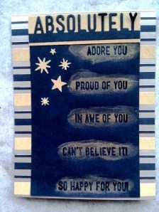
Well, this card turned out very different from my original idea!

A masculine card for my grown nephew.

A masculine card for my grown nephew.

I have this stamp and die set from Simon Says Stamp with all the sentiments coordinating with the Absolutely die. Originally I had planned to die-cut Absolutely from a piece of white card stock and then print the various sentiments in bright colors down the middle. But when I sat down at my craft table, I decided to go for a more dramatic look with the black paper. I thought I could emboss the sentiments using a champagne-colored Versamark ink pad and have them really stand out against the black background. Well, they didn’t. They were really hard to see.

So then I decided to try my Perfect Pearls powder in gold–the first I had ever used Perfect Pearls. It definitely stands out more; I’m just not sure how much I like it.

At that point I had to change the background paper to coordinate with the black and gold background. The black patterned paper on kraft paper I had intended just didn’t work. Luckily, I found this 12×12 paper pad from the Paper Studio called Simple Elegance that has a lot of black and gold papers in it. I liked using the stripes horizontally rather than vertically to give it a more modern look.

The final touch was punching some stars in gold paper (from the same paper pad) using my Martha Stewart punch. This punch is quickly becoming a favorite!

I think I like the final result. It’s darker, more formal and more masculine than I had planned, but I think it will work as a congratulations card for my nephew when he graduates from college.

Please let me know what you think!

Happy Easter Card

Here’s a quick Easter card I made to send to my mom:

Three little bunnies for my mom.

Three little bunnies for my m.

Very simple design – I don’t have a lot of Easter stamps or papers in my stash! I used a Cuttlebug embossing folder on the background, a Martha Stewart punch at the bottom, and a Martha Stewart punch for the bunnies. I tried using a Snow pen to make fluffy cotton tails, but they aren’t as fluffy as I would like. The stamp sentiment is from Hero Arts.

Happy Easter!

Pattern Play: Bonus Birthday Card

In this Online Card Class Pattern Play bonus episode, we combined a variety of paper patterns to create a pinwheel effect on a card. Here’s my take:

Creating a pinwheel design from patterned paper...

Creating a pinwheel design from patterned paper…

As you can see , I focused on a birthday theme, using all the same bright patterns from a Paper Studio pad. I also used a stamp and die set to create the cupcake and candle, which I colored with my Derwent Inktense pencils. I stamped “happy b-day” from the Mama Elephant typewriter stamp set that I used in my last post.

I dry-embossed the front of the card using a chevron pattern from a Cuttlebug folder. I also rounded two opposite corners of the card with my Corner Chomper and did the same to the patterned paper. As a final stamp, I used my Martha Stewart stars punch to punch tiny little stars out of glitter paper, which I adhered with both glue and foam tape.

This one goes in the mail this week for my friend Mike’s birthday. I think it will be a nice surprise!

Happy crafting!